Walk into any high-speed railway station waiting hall and you'll see it: ads crammed with product bullet points, text so small you need to squint, QR codes big enough to swallow half the layout, color schemes that are either screaming red-gold or fluorescent green on bright yellow. From a distance it looks like a signboard. Up close it's a brochure glued to the wall.
This type of ad has a colloquial name — "psoriasis". It's not an insult. It describes something that looks like those illicit flyers plastered on street walls: information density so high that everything gets stuffed in and nothing gets remembered.
The root cause? Brands treat station advertising as "a place where you can put lots of things" rather than "a place where people look for one second."
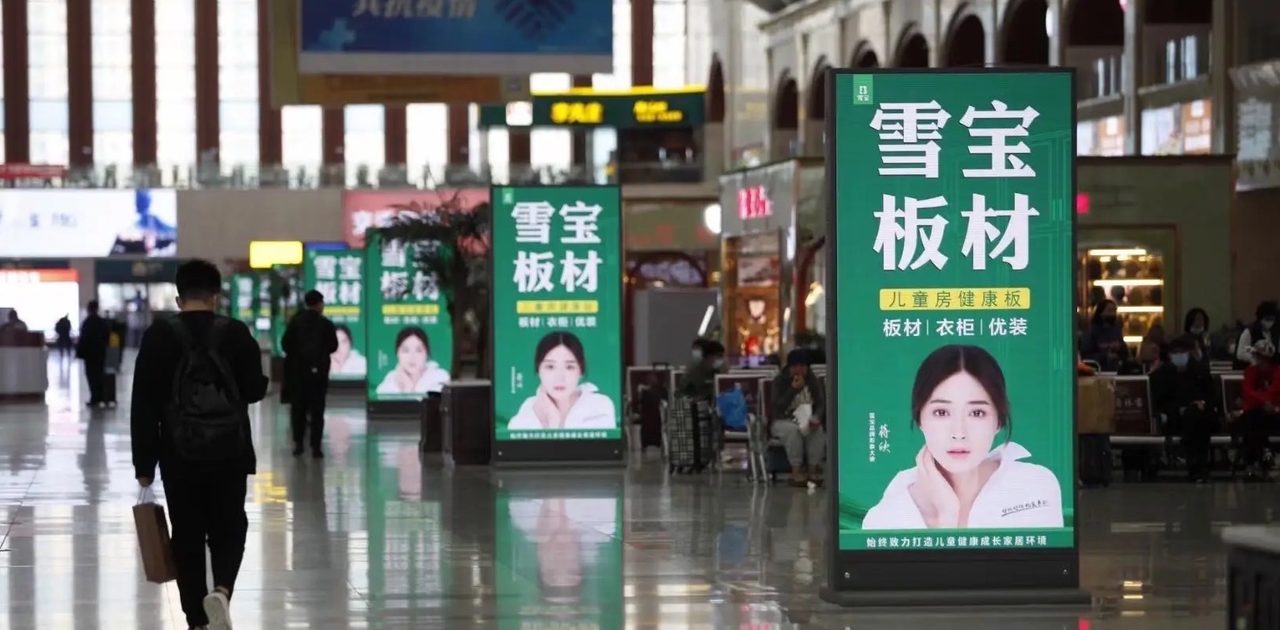
Digital screens at Yulin North Station's waiting hall. Note the structure: brand name is large, core info fits one line, no clutter.
1. First, Accept This Fact: Travelers Give You One Second
The outdoor advertising industry has an iron rule validated again and again: a moving traveler's effective attention span for any single ad is 0.5 to 1 second.
This isn't hyperbole. When someone is walking, searching for the ticket gate, checking their phone, pushing luggage — their peripheral vision glances at a light box or screen for about that long. After one second, they've either walked past or their attention has returned to their phone screen.
What this means: if your headline exceeds eight characters (in Chinese) or roughly six words (in English), you might as well have written nothing. If your visual contains more than three focal points — say, a logo, product image, QR code, phone number, and address all competing — the brain simply opts out of processing it.
The industry calls this the "one-second cognition rule." Ads that break it end up as expensive wall paint — sure, they cover surface area, but nobody remembers what was written on them.
2. Six Practical Rules, Explained One by One
Rule 1: One Frame, One Message
The most common mistake is shrinking an entire corporate brochure onto a single light box. Company building photo, ten-plus product names, three lines of contact info, two QR codes, a slogan — all jammed together.
The right approach: convey exactly one thing per frame. "We do X" or "Product Y launched" or "Scan for coupon." Pick one, cut everything else. If you absolutely must communicate two things, split them across two rotating frames — never force them into the same one.
Rule 2: Dominant Visual Should Occupy ≥70%
The "dominant visual" is whatever grabs the eye first — usually a high-quality product shot, scene photo, or portrait. It should cover at least 70% of the frame area. Text plays a supporting role; it isn't the lead actor.
Look at outdoor ads that actually work: Wang Lao Ji's green can takes up 80% of the frame with seven characters tucked at the bottom. Nike's swoosh claims two-thirds of the space with the slogan hidden in a corner. They all follow the same logic: the image speaks, text wraps up.
Rule 3: Copy Under 15 Characters, Headline Under 8
This isn't about stifling creativity. It's about respecting reality. Travelers won't stand in front of your light box reading a paragraph. Walking while glancing, the amount of information they can absorb is limited.
Good copy vs. bad copy isn't about word count — it's about whether you can make your point in one sentence. "Global investment invitation now open" crushes "we sincerely invite distinguished individuals from all walks of life to join hands in creating a brilliant future." The former takes three seconds to grasp. By the time anyone finishes reading the latter, they're already 20 meters down the corridor.
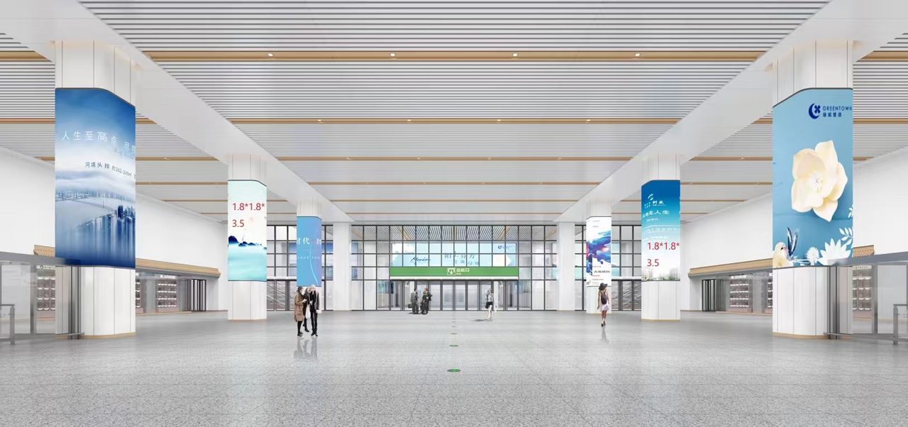
Pillar wraps at Yulin North Station. Pillars are narrow and tall — they punish clutter even more severely than flat panels. One line of text beats three every time.
Rule 4: QR Code Goes in the Corner — Never Let It Steal the Show
Somewhere along the way, brands decided bigger QR codes are better. Some fill the entire bottom-right corner with a black-and-white square. Result: the first thing travelers notice is that QR code, not the brand name.
A QR code belongs in the bottom-right or bottom-left corner, sized at no more than 5% of total frame area. It's a call-to-action entry point, not a visual centerpiece. If you want people to scan, don't enlarge the code — make them interested in the content first.
Rule 5: Absolute Language Is Off-Limits
"National-level," "best," "number one," "top-tier" — these words are red lines under China's Advertising Law, with fines starting at 200,000 yuan. Even without legal risk, such language lost its persuasive power years ago. When consumers see "nationwide leader," their first reaction isn't "impressive." It's "here we go again."
Use concrete numbers instead of empty adjectives. "Serving over 5,000 clients" beats "industry leader." "Three consecutive years of growth" beats "far ahead of competitors." Numbers don't lie. Clichés do.
Rule 6: Use Real Scene Photos, Avoid Pure Text Blocks
Pure-text layouts are practically invisible in railway stations. The human brain processes images roughly 60,000 times faster than text. A solid product-in-use shot, a real store photo, or even a tasteful material close-up will capture attention far better than walls of dense text.
If you genuinely lack suitable imagery, blow up your brand logo with one clean line of copy rather than filling the entire frame with pure text.
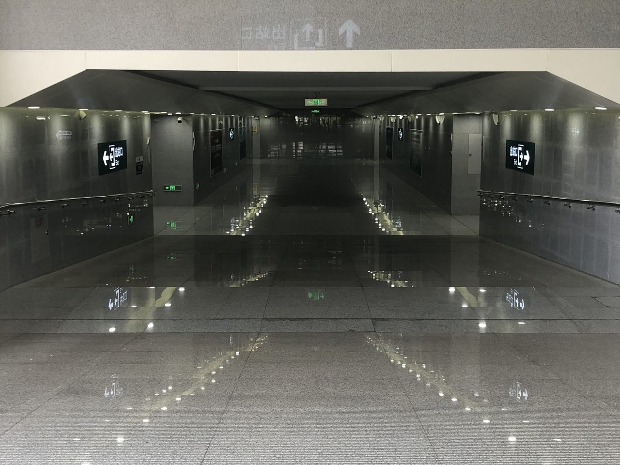
The exit passage at Yulin North Station. Travelers slow down here and attention recovers slightly — but dwell time remains short. Your creative must land in a single glance.
3. Good Creative vs. Bad Creative: The Difference in Three Lines
Boiling down the six rules above, the gap between effective and ineffective station ad creative comes down to three things:
Dimension
Good Creative
Bad Creative ("Psoriasis")
Information load
1 core message
3–5 messages stacked
Text volume
≤15 chars, headline ≤8
30+ chars, multiple lines
Dominant visual
≥70% of frame
Fragmented by text & QR codes
QR code placement
Corner, ≤5% of area
Giant block in corner
Language
Concrete numbers, plain talk
"National-level," "top choice," "leading"
Imagery
Real scenes / product shots
Pure text or low-res stock photos
4. A Straight Talk Closing
Railway station ad slots aren't cheap. LED screens run tens of thousands per month; light boxes cost upwards of ten thousand. Spending that money on poorly designed creative is like renting a billboard to prove you don't understand advertising.
Flip it around: strong creative can triple the impact of the same slot. No bigger budget needed. No extra frequency. Just spend more effort at the design stage: cut the excess, enlarge the main visual, shrink the QR code back to where it belongs.
If you're preparing creative for any of the three Nanyu Railway stations, run your artwork against these six standards before sending it for production. Pass = go live. Fail = revise first. Money spent is money spent — don't let it vanish into thin air because of a sloppy design.
— Lianping Media, Exclusive Ad Operator for Nanzhu Railway Nanyu Section | Li Hongxin 18878774848 (WeChat)